The challenge
A new foundry with beautiful type and no voice of its own.
Mono’s typefaces were quiet and precise, but the launch plan relied on loud colour and trend-led visuals that hid the letters.
Identity, specimen system and a live type tester for an independent type foundry that prizes restraint.
A new foundry with beautiful type and no voice of its own.
Mono’s typefaces were quiet and precise, but the launch plan relied on loud colour and trend-led visuals that hid the letters.
Let the letters be the brand.
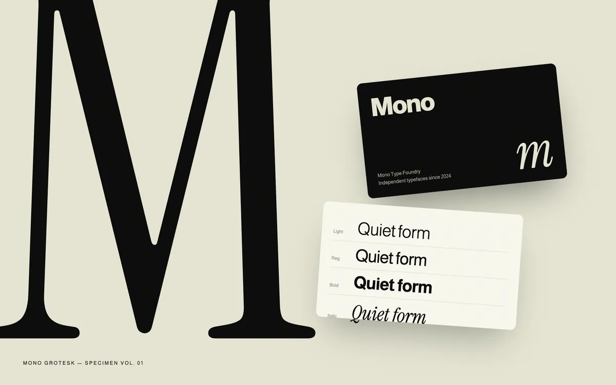
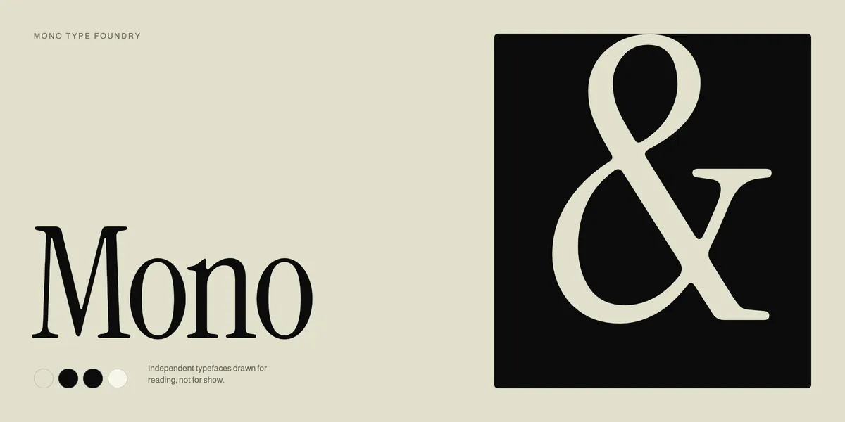
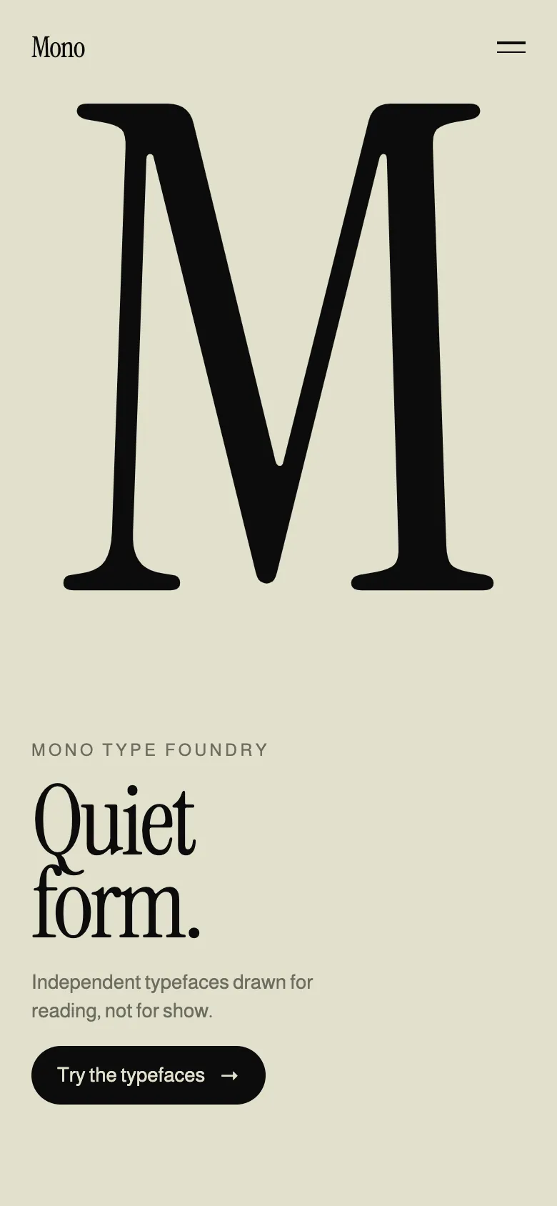
Two colours, one serif and the glyphs themselves at enormous scale. Nothing else competes with the type.
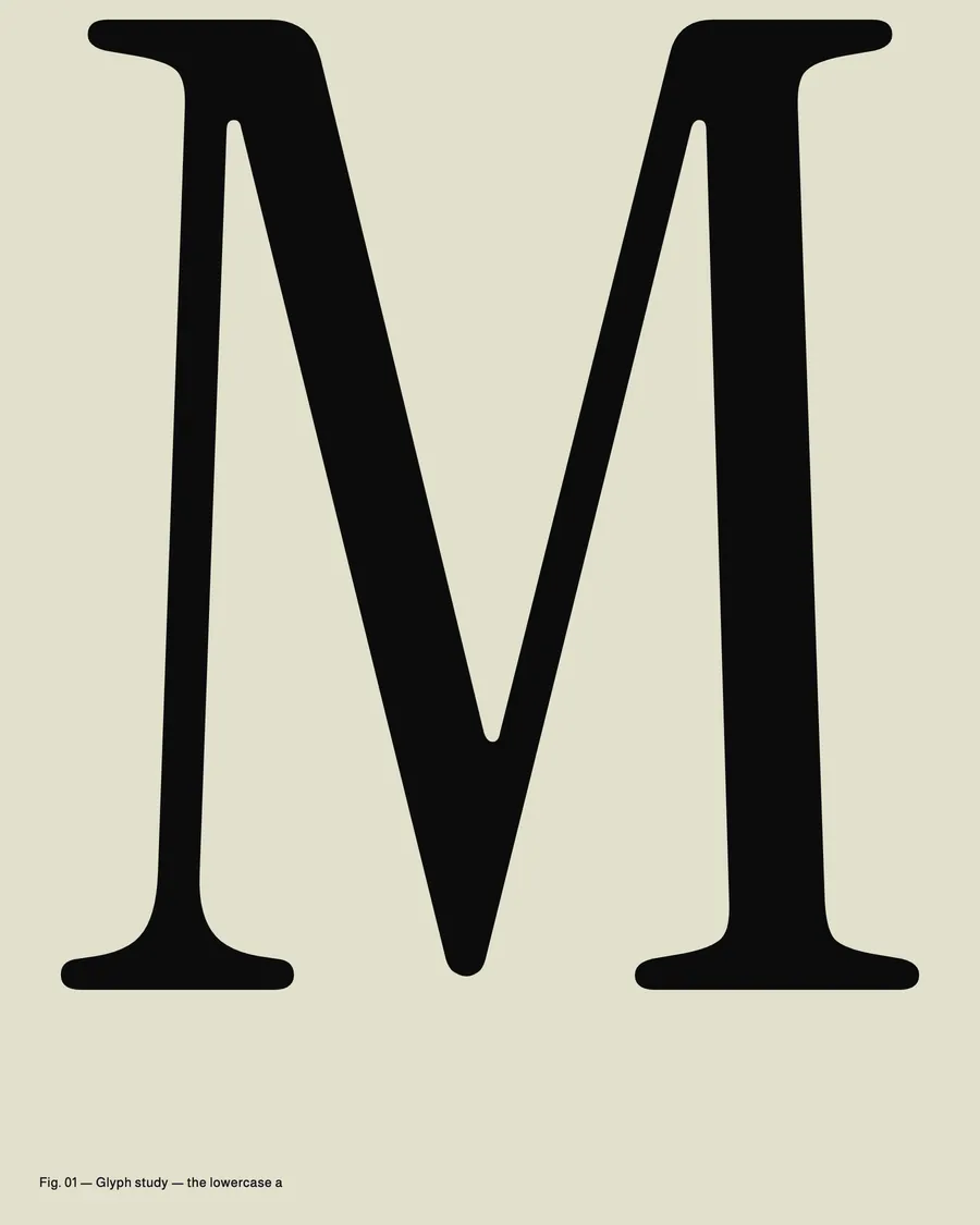
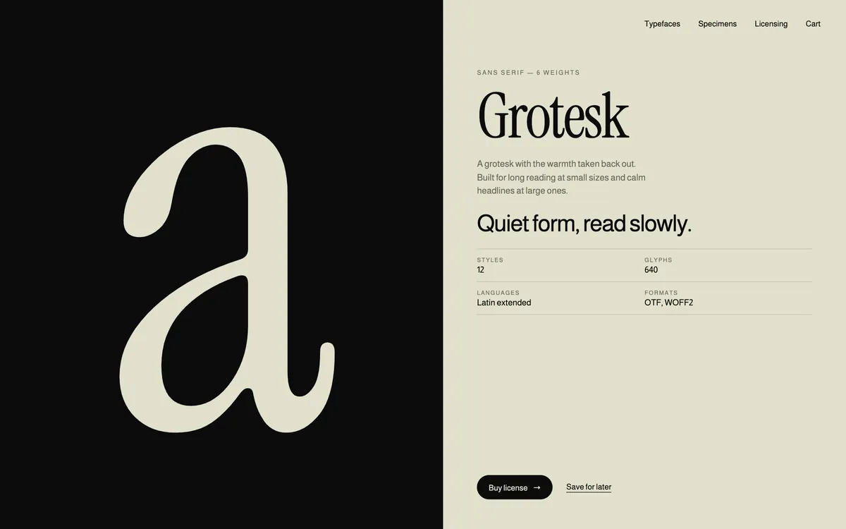
An identity system, printed specimens and a live online tester.
Business cards, specimen books and a website where every typeface can be tried, compared and licensed in one place.
The foundry launched with a voice as precise as its type.
Every touchpoint now shows the work instead of decorating around it.
Qoro led 5 disciplines on Mono, carried by one small team from first conversation to launch.
The palette and typefaces behind Mono. Tap a colour to copy its value.
ABCDEFGHIJKLMNOPQRSTUVWXYZ
abcdefghijklmnopqrstuvwxyz
0123456789 &?!
ABCDEFGHIJKLMNOPQRSTUVWXYZ
abcdefghijklmnopqrstuvwxyz
0123456789 &?!
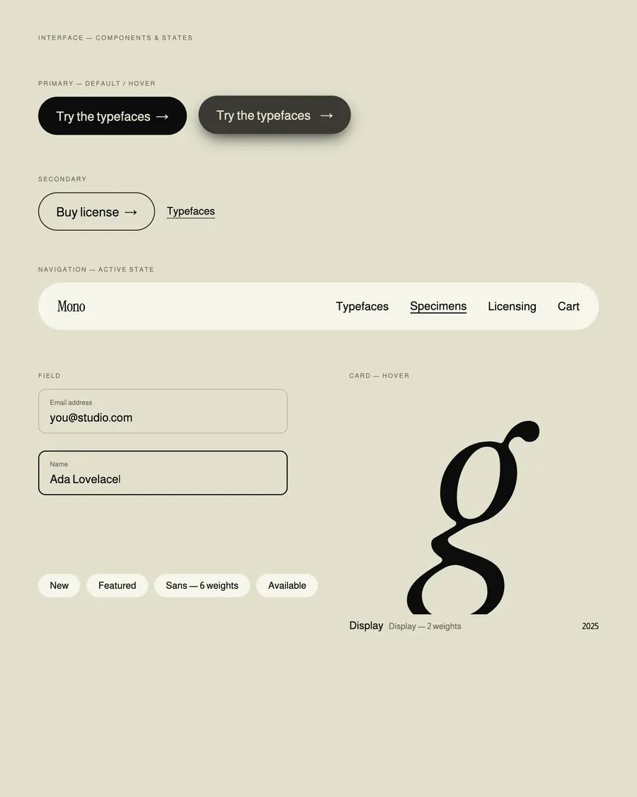
Mono
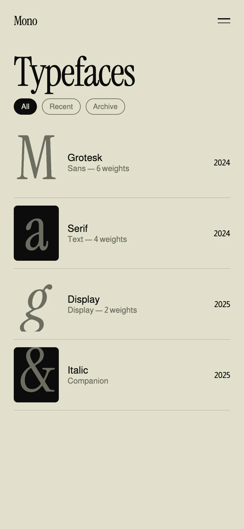
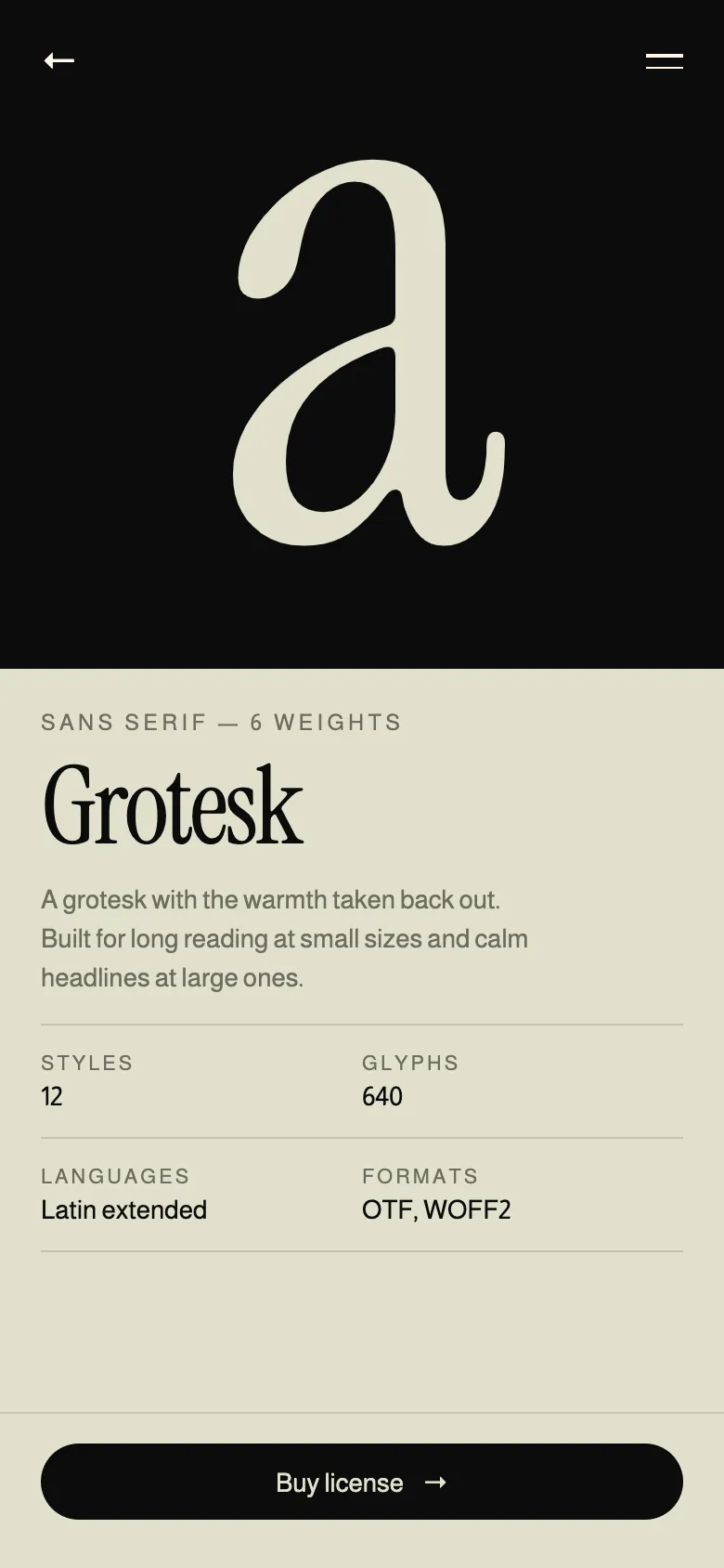
Homepage, index and inner pages, designed as one system across desktop and mobile.
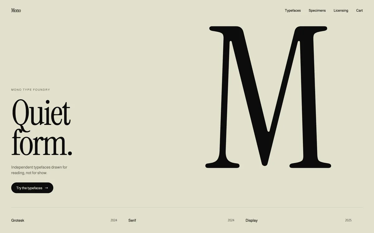
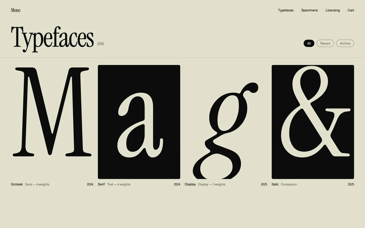
Redesigned for the thumb, not shrunk from the desktop.
Restraint as a point of view.
One identity from print to screen.
Live testing before licensing.
An identity that steps aside so the letters can speak.