The challenge
Objects made to last decades, sold through a shop built in a weekend.
Ferro’s pieces are bent and brushed by hand, but online they sat in a generic theme next to discount banners.
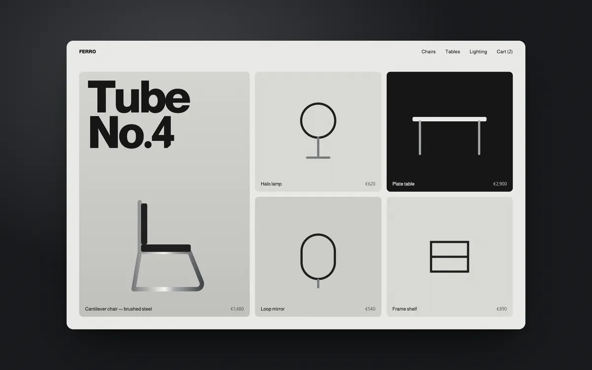
A headless storefront for a Milanese steel furniture maker, where every product page reads like a spread from a printed catalogue.
Objects made to last decades, sold through a shop built in a weekend.
Ferro’s pieces are bent and brushed by hand, but online they sat in a generic theme next to discount banners.
Treat the shop as a catalogue first and a checkout second.
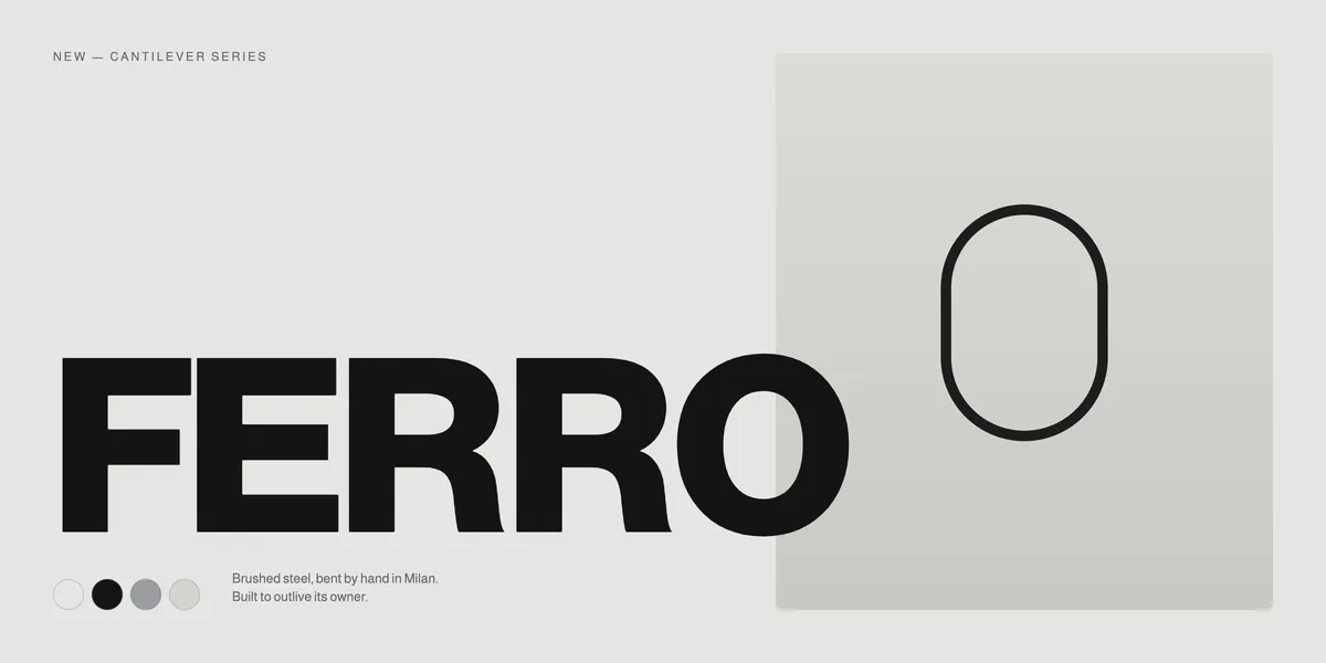
Heavy grotesk headlines, cool steel neutrals and generous product photography framed like museum objects.
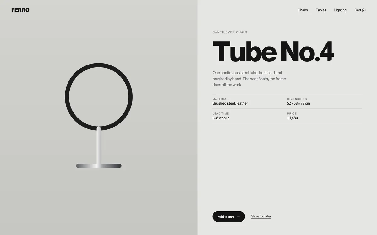
A fast headless storefront with editorial product pages.
Each object gets a spread: material, dimensions, lead time and the story of how it is made, with checkout one tap away.
The shop now feels as solid as the furniture.
Ferro has a storefront it owns completely, ready for new collections without a redesign.
Qoro led 4 disciplines on Ferro, carried by one small team from first conversation to launch.
The palette and typefaces behind Ferro. Tap a colour to copy its value.
ABCDEFGHIJKLMNOPQRSTUVWXYZ
abcdefghijklmnopqrstuvwxyz
0123456789 &?!
ABCDEFGHIJKLMNOPQRSTUVWXYZ
abcdefghijklmnopqrstuvwxyz
0123456789 &?!
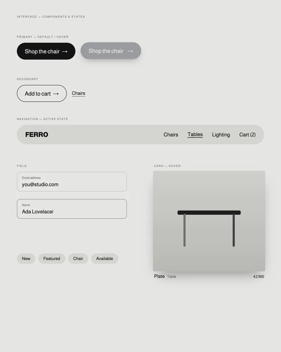
Ferro
Homepage, index and inner pages, designed as one system across desktop and mobile.
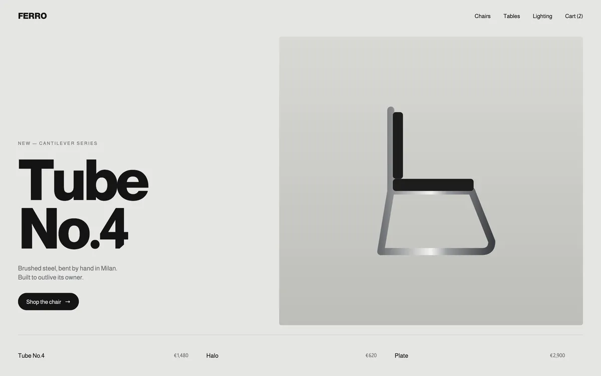
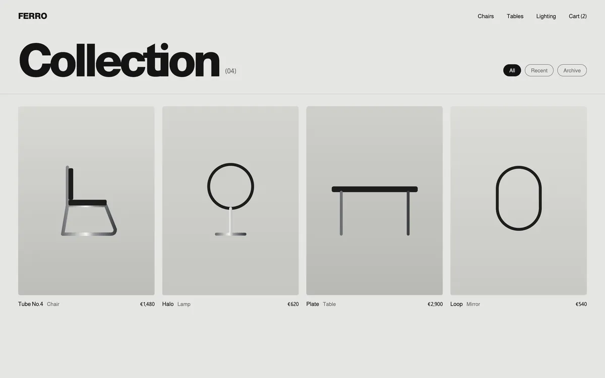
Redesigned for the thumb, not shrunk from the desktop.
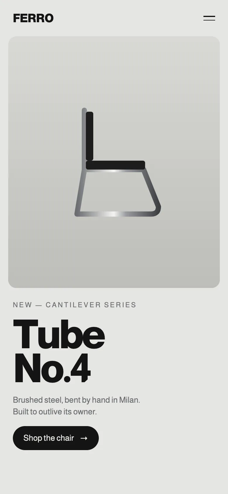
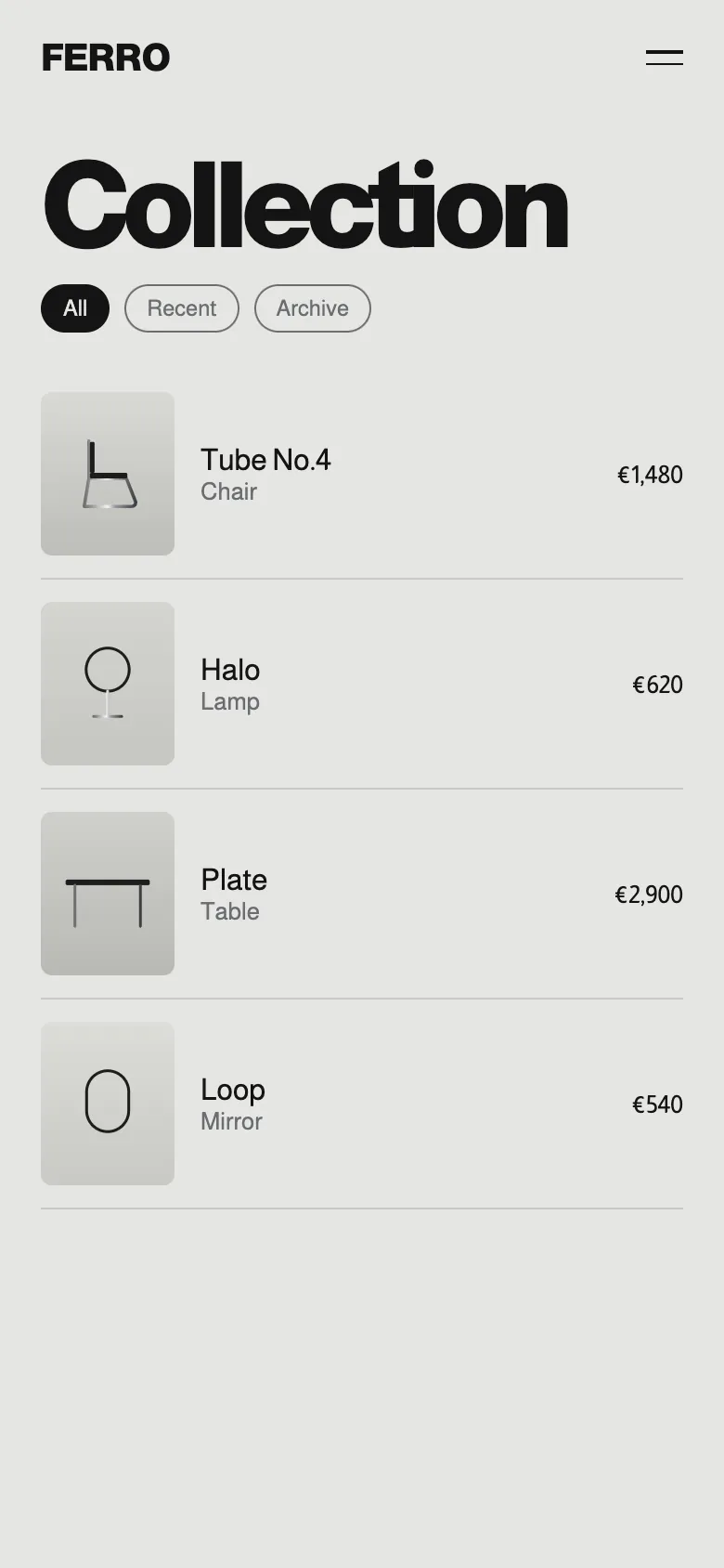
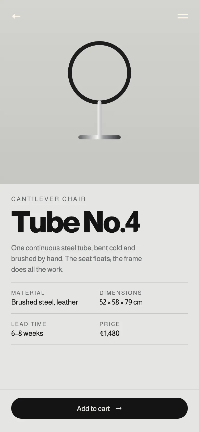
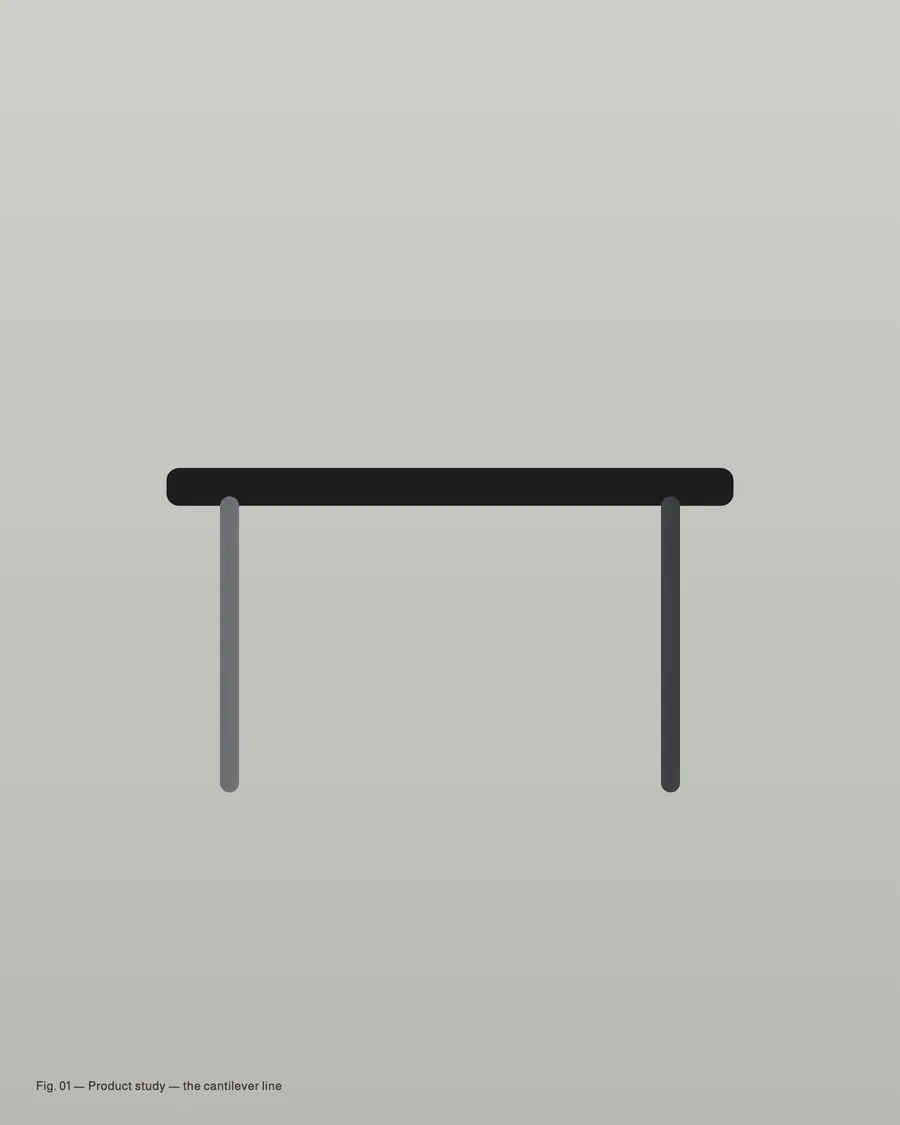
Products presented like objects, not stock.
A headless stack Ferro controls.
New collections without a redesign.
A storefront with the weight, and the patience, of steel.