The challenge
A celebrated practice hidden behind a cluttered, dated portfolio.
Halden’s work spoke of restraint and material honesty. Their website spoke of neither: dense grids, small images and no sense of scale.
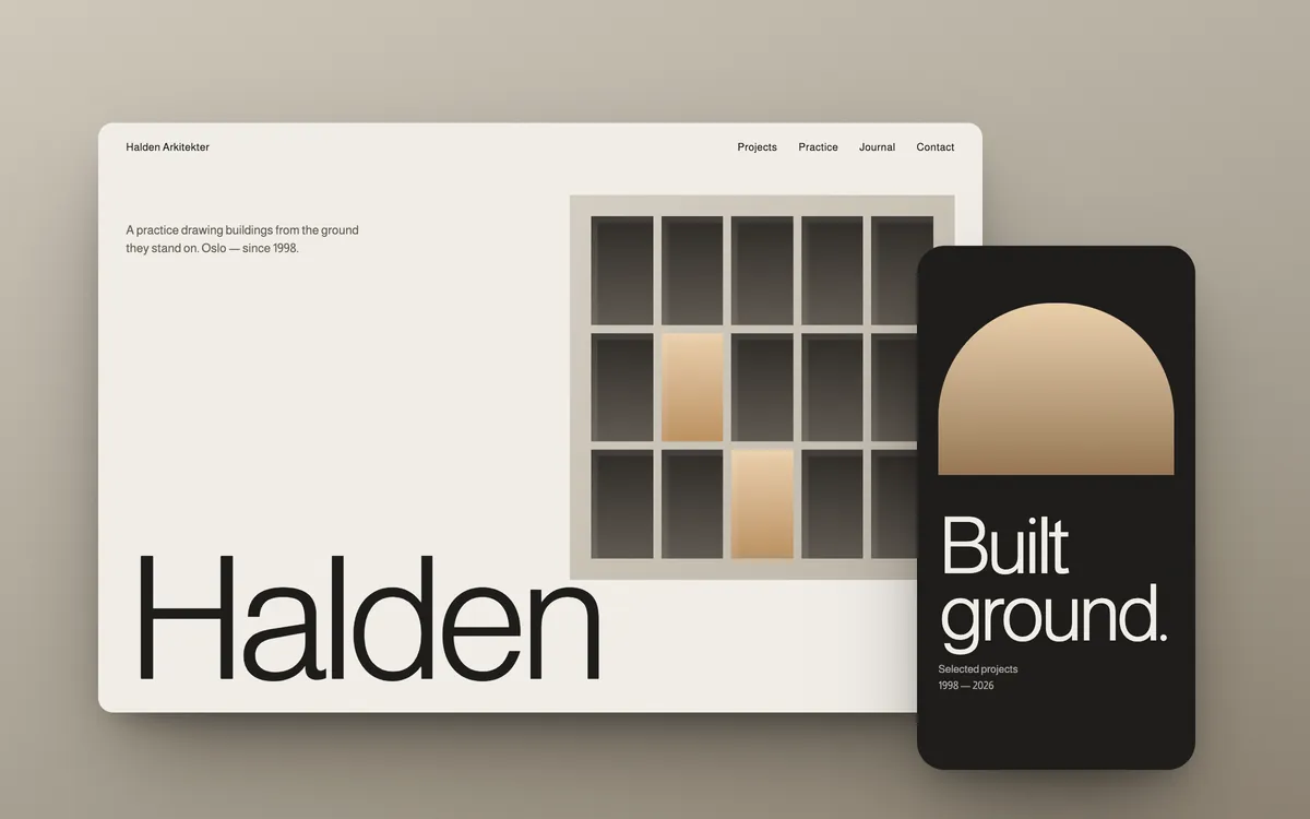
A gallery-quiet website for an Oslo architecture practice that draws buildings from the ground they stand on.
A celebrated practice hidden behind a cluttered, dated portfolio.
Halden’s work spoke of restraint and material honesty. Their website spoke of neither: dense grids, small images and no sense of scale.
Design the site the way Halden designs a building — from the ground up.
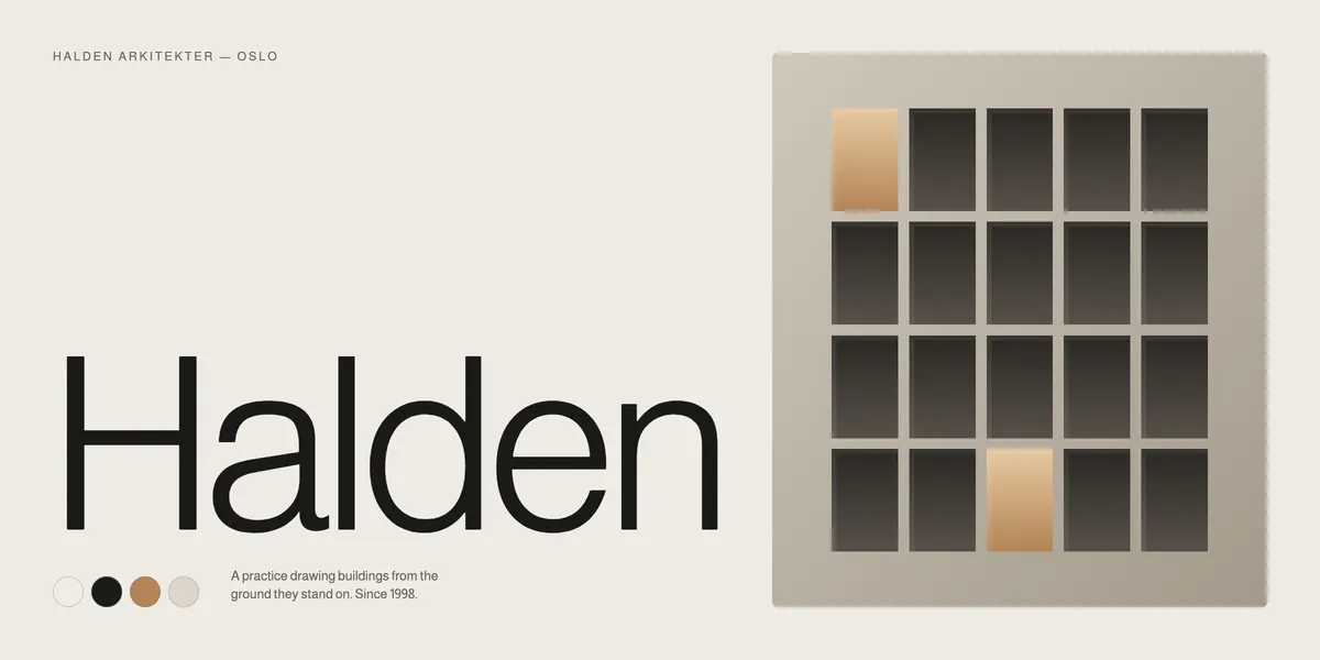
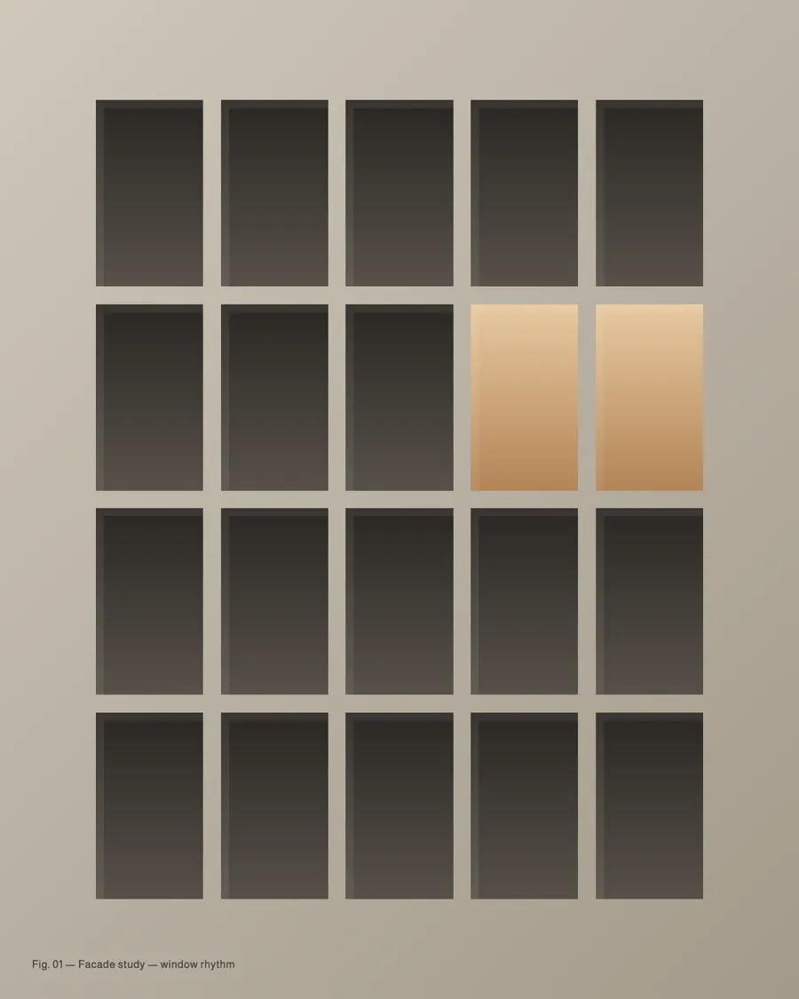
We built a strict facade-like grid, a single light weight of type and a warm stone palette taken directly from their materials.
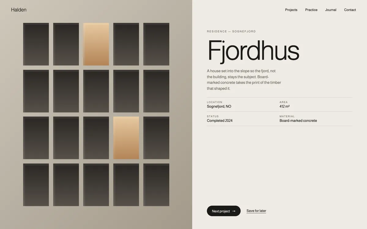
A calm, image-led site where every project gets a full room.
A project index that reads like a drawing register, long-form project pages and a journal for the practice’s thinking.
The practice now has a presence as considered as its architecture.
The site gives the work scale, silence and context, and gives the team one place to tell its story.
Qoro led 5 disciplines on Halden, carried by one small team from first conversation to launch.
The palette and typefaces behind Halden. Tap a colour to copy its value.
ABCDEFGHIJKLMNOPQRSTUVWXYZ
abcdefghijklmnopqrstuvwxyz
0123456789 &?!
ABCDEFGHIJKLMNOPQRSTUVWXYZ
abcdefghijklmnopqrstuvwxyz
0123456789 &?!
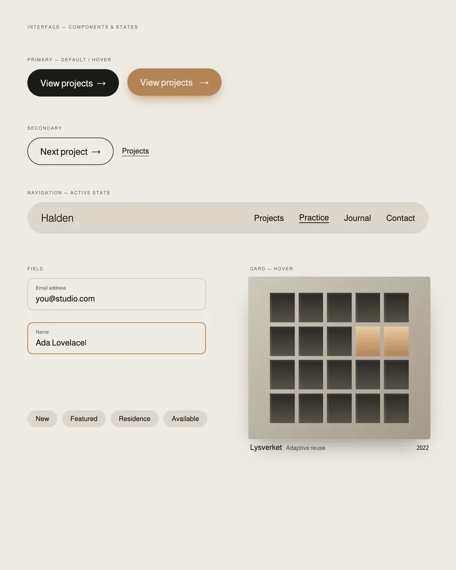
Halden
Homepage, index and inner pages, designed as one system across desktop and mobile.
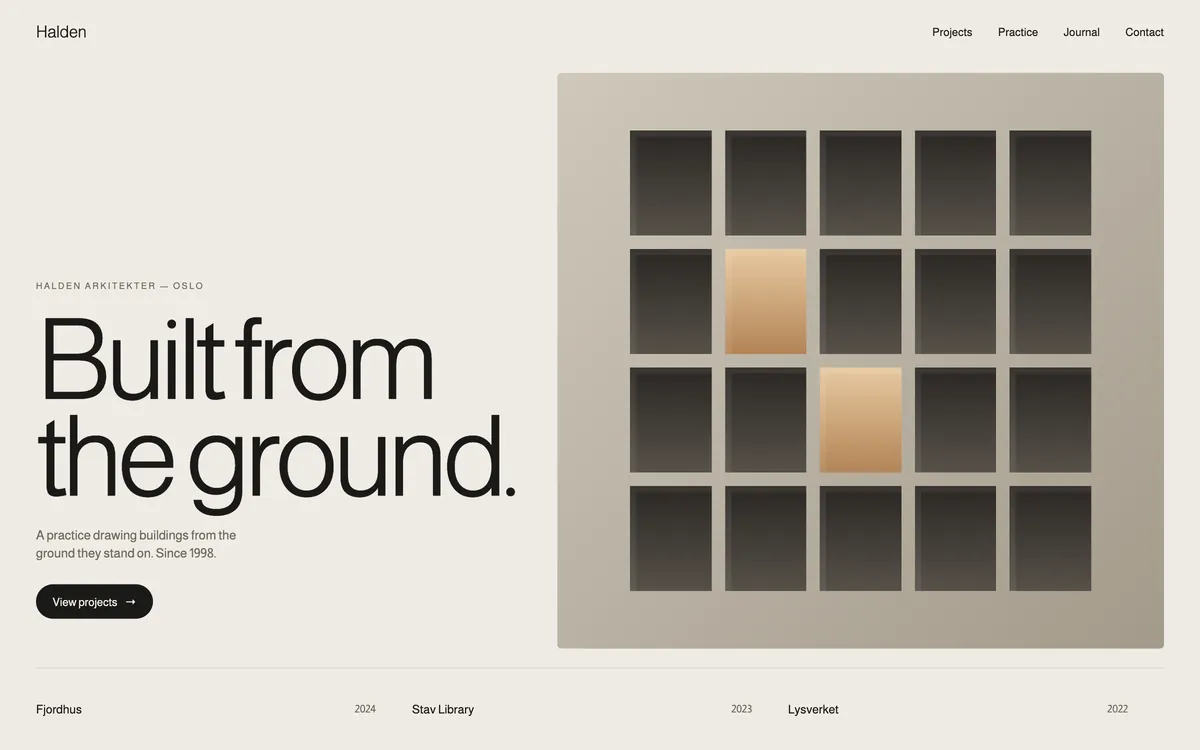
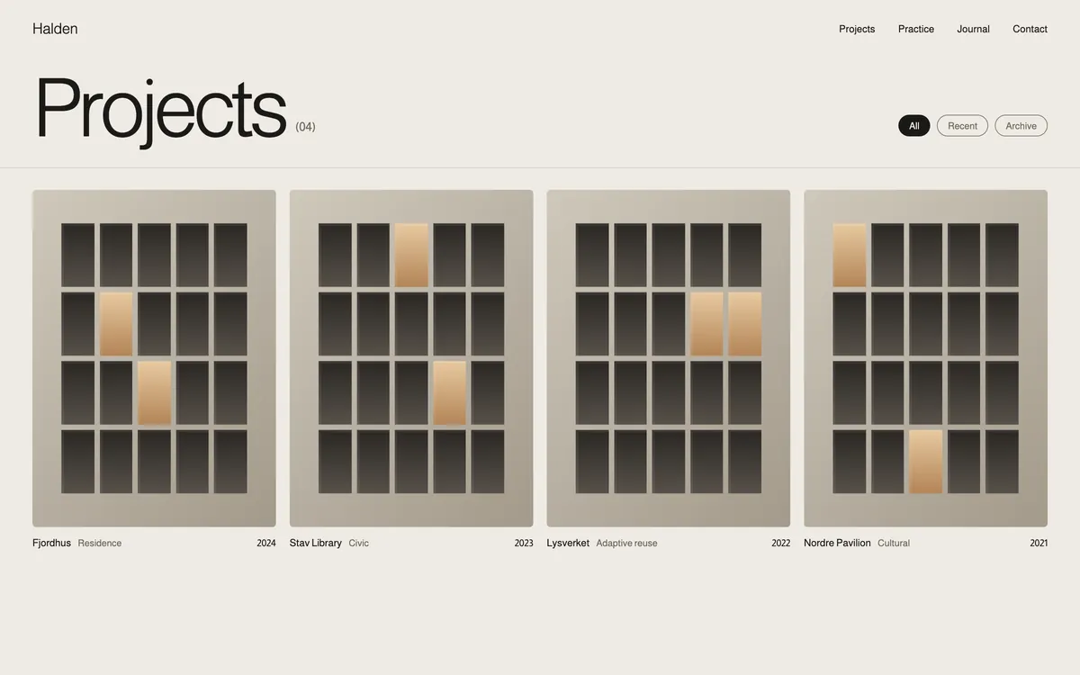
Redesigned for the thumb, not shrunk from the desktop.
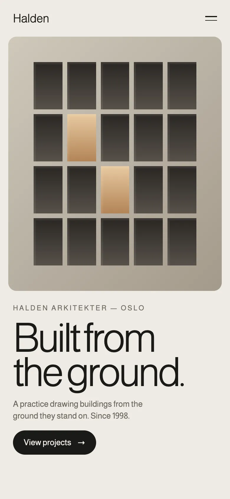
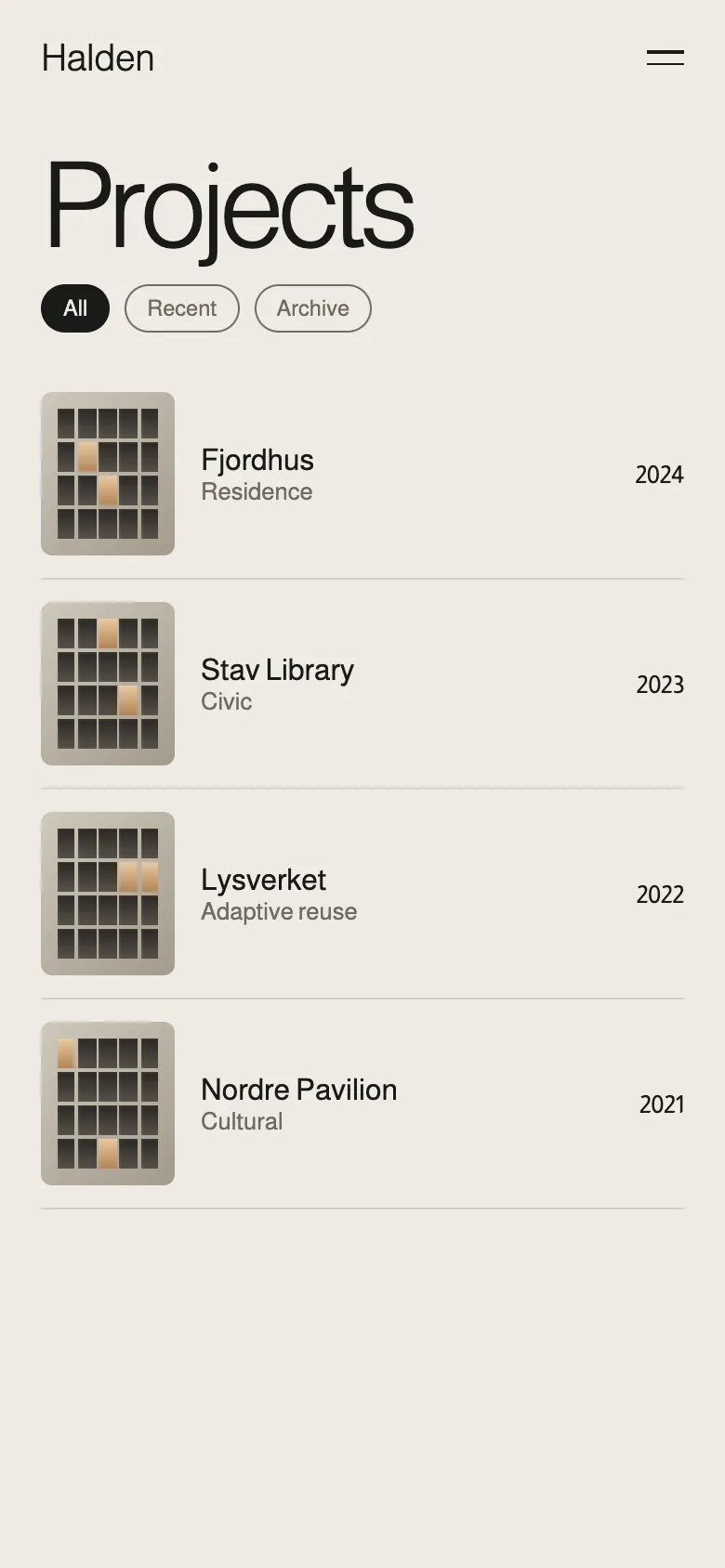
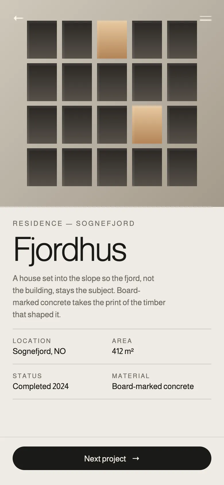
Projects shown at the scale they deserve.
Restraint made visible in every screen.
A CMS the team updates without developers.
A website built the way Halden builds — from the ground it stands on.